In the fast-paced digital age, where technology is constantly evolving and users are accessing websites through an ever-increasing array of devices, responsive web design has emerged as a crucial aspect of web development. It not only adapts to the changing digital landscape but also ensures an optimal user experience across a variety of screen sizes and devices. Understanding the benefits of responsive web design is essential for anyone involved in creating or managing online content.
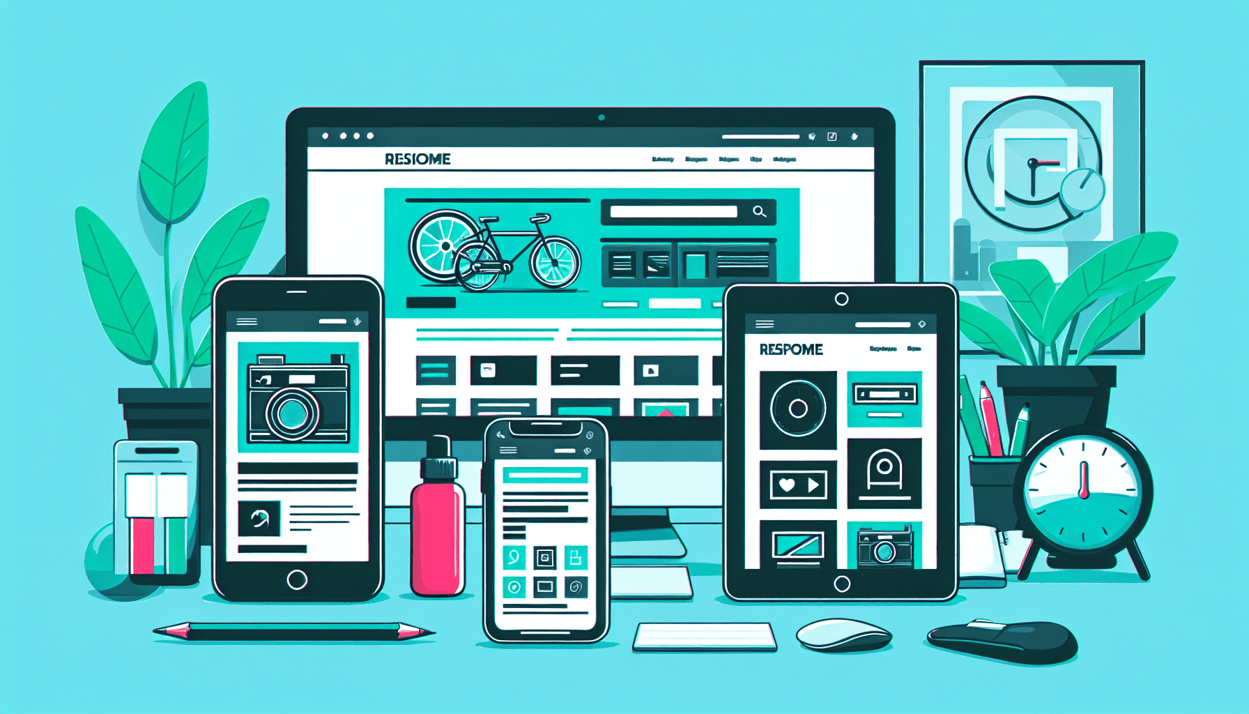
At its core, responsive web design enables websites to render effectively on a wide variety of devices and screen sizes. This is achieved through the use of flexible grids, fluid images, and CSS media queries, ensuring that web content automatically adjusts based on the device's screen size. By doing so, it enhances the user experience, which is fundamental in keeping users engaged and satisfied with a website.
One of the primary benefits of responsive web design is improved accessibility. In a world where users have instant access to the internet via smartphones, tablets, laptops, and even smart TVs, ensuring your website is easily accessible across these devices is crucial. Responsive design eliminates the need for separate mobile and desktop versions of a website, streamlining the user experience. This accessibility across all devices means users can seamlessly navigate and interact with your site, whether they're on a phone during their morning commute or using a desktop at work.
Furthermore, responsive web design is vital for search engine optimization (SEO). Search engines, particularly Google, prioritize websites that are mobile-friendly. With Google's mobile-first indexing, a website's mobile version is indexed and used for ranking purposes. A responsive design ensures that your website meets these requirements, potentially improving your search engine rankings. This approach also helps consolidate analytics and reporting since all data comes from one responsive site, rather than multiple versions of a site.
Cost efficiency is another important benefit. Maintaining separate websites for different devices can be time-consuming and costly. By utilizing a responsive design, businesses can streamline their operations, reducing the need for multiple updates and maintenance efforts across various site versions. This approach not only lowers costs but also simplifies the development process and reduces the time required to bring new content to users.
Responsive web design also allows for improved user engagement. A site that is easy to navigate, regardless of the device used, encourages users to explore more and spend longer periods on the site. This can lead to higher conversion rates, as an enjoyable browsing experience fosters trust and satisfaction among visitors. Additionally, a cohesive design across all devices can strengthen brand identity, ensuring a consistent look and feel whenever users interact with the website.
Lastly, responsive web design addresses the challenge of future-proofing. As new devices and screen sizes emerge, a site built with a responsive framework can easily adapt to these changes, maintaining performance and aesthetics. This adaptability is essential in a dynamic tech environment where user habits and preferences continuously evolve.
In conclusion, responsive web design is no longer a luxury but a necessity in the digital age. By offering improved accessibility, better SEO rankings, cost efficiency, enhanced user engagement, and future-proofing capabilities, it delivers a comprehensive solution for creating websites that meet the demands of modern users. As technology continues to advance, the ability to deliver a seamless and adaptable user experience across all devices will undoubtedly remain a cornerstone of successful web design.